Every tool you need
to ship production CSS.
Eight complete feature sections. One generated file. Zero dependencies on the other side.
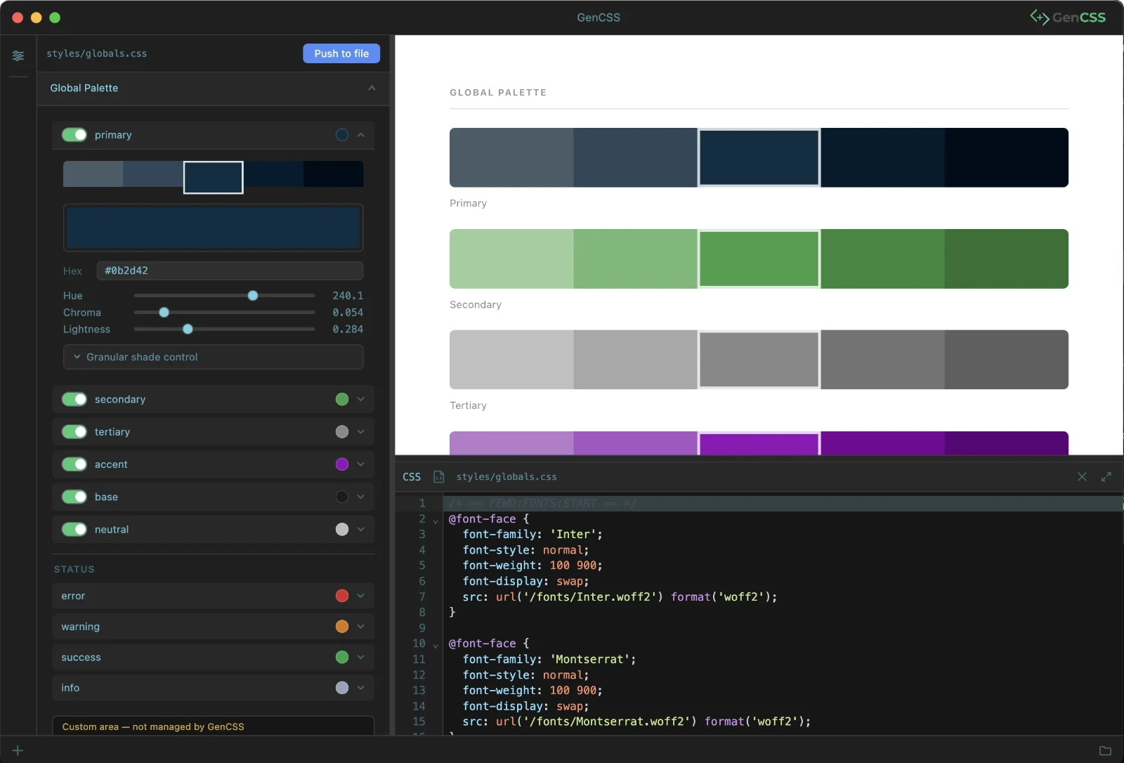
OKLCH Colour System
Perceptually uniform. Automatically scaled.
GenCSS generates a complete colour palette from a single hex value. Using the OKLCH colour space — perceptually uniform, wide-gamut — you get shades, tints, and transparency variants that look right in every context.
- Full shade/tint scale generated from one primary pick
- Transparency variants for overlays, borders, and states
- Status colours: error, warning, success, info
- CSS custom properties with semantic naming
/* pick a hue above */Fluid Typography
Scales between breakpoints. Zero media queries.
A full type scale built with CSS clamp(). Each size interpolates smoothly between a mobile base and a desktop target — no hard breakpoints, no layout shifts, no maintenance overhead.
- clamp()-based scale with configurable base and ratio
- Display, heading, and body size tokens
- Font family tokens for body, heading, and monospace
- Leading, tracking, and weight scale
/* select a ratio above */Fluid Spacing
Consistent rhythm, everywhere.
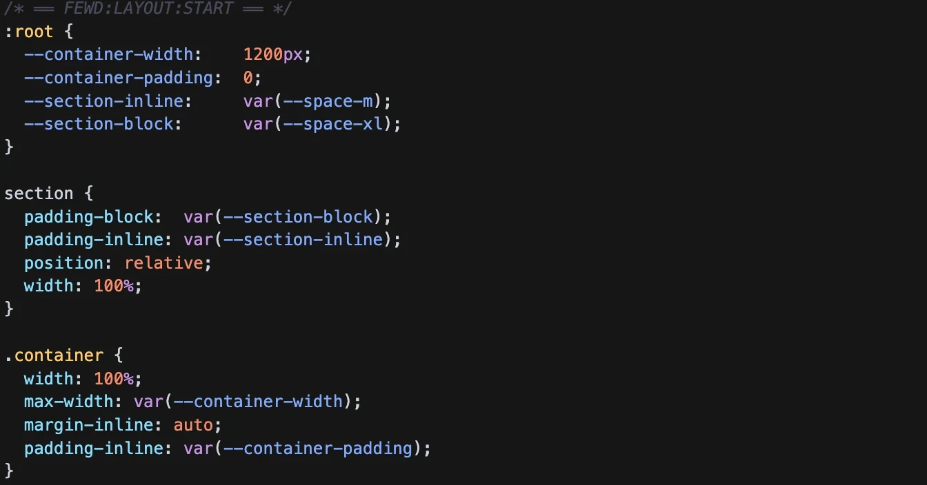
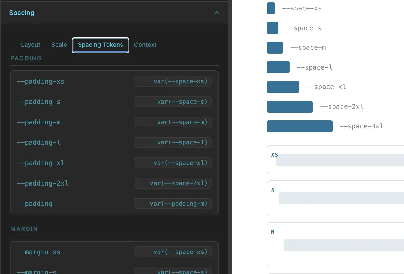
The same fluid approach applied to spacing. A seven-step scale that clamps between mobile and desktop values, ensuring visual rhythm stays consistent whether you're on a phone or a 4K display.
- Seven-step fluid spacing scale (xs → 3xl)
- Container-query-aware variants with .cq-spacing
- Semantic tokens: padding, margin, gap
- Negative space helpers built in
/* select a ratio above */Container-Query Typography
Type that responds to its component, not the page.
One class — <code>.cq-fluid</code> — rewrites every <code>--text-*</code> token in its subtree to use <code>cqi</code> units instead of <code>vw</code>. Drop it on any element and its typography scales to that element's width, regardless of the viewport.
- .cq-fluid establishes container-type: inline-size automatically
- All --text-* tokens override to cqi-based clamp() values inside
- Sidebar, card, modal, grid cell — each gets perfectly sized type
- Combine with .cq-spacing for fully container-aware components
Display
Heading
Subheading
Body large
Body — scales with this container, not the viewport. Sidebar, card, modal: each gets perfectly sized type.
Native Dark Mode
Both schemes. One file. No hacks.
GenCSS outputs colour scheme tokens with light and dark variants using prefers-color-scheme and data-theme attribute support. Both are baked into the generated file — ready to wire up to a toggle or leave on auto.
- Semantic colour assignments for light and dark
- prefers-color-scheme media query support
- data-theme attribute switching built in
- Configurable per-scheme surface, text, and border tokens
Design tokens.
One file.
Colours, typography, spacing and dark mode — generated from your settings, output as plain CSS.
/* select a palette */Two-Layer Architecture
Primitives feed tokens. Tokens feed components.
Layer 1 holds raw values. Layer 2 holds semantic tokens that point to those primitives. Change the primitive and everything cascades. This is how maintainable design systems are built.
- Clear separation between raw values and semantic meaning
- Single-source palette drives all downstream tokens
- Component tokens reference semantic tokens — not raw values
- The same architecture used by major design systems
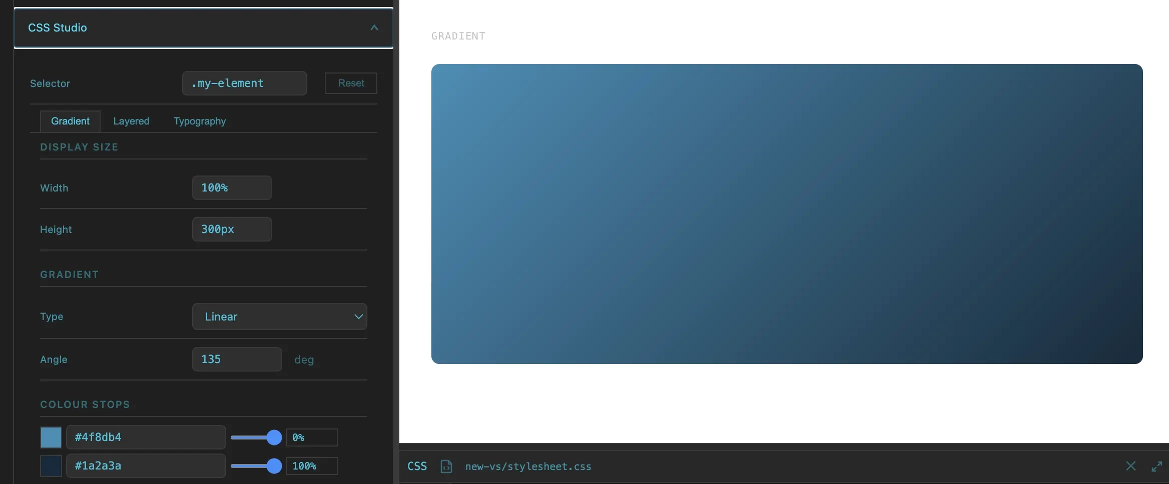
CSS Studio
One-off assets. Generated in seconds.
A visual builder for CSS effects that don't belong in a global system but still need to look polished: gradients, background textures, glassmorphism panels, text treatments.
- Gradient builder with live preview
- Background effect generator
- Typography treatment builder
- Copy-paste CSS output — no dependencies
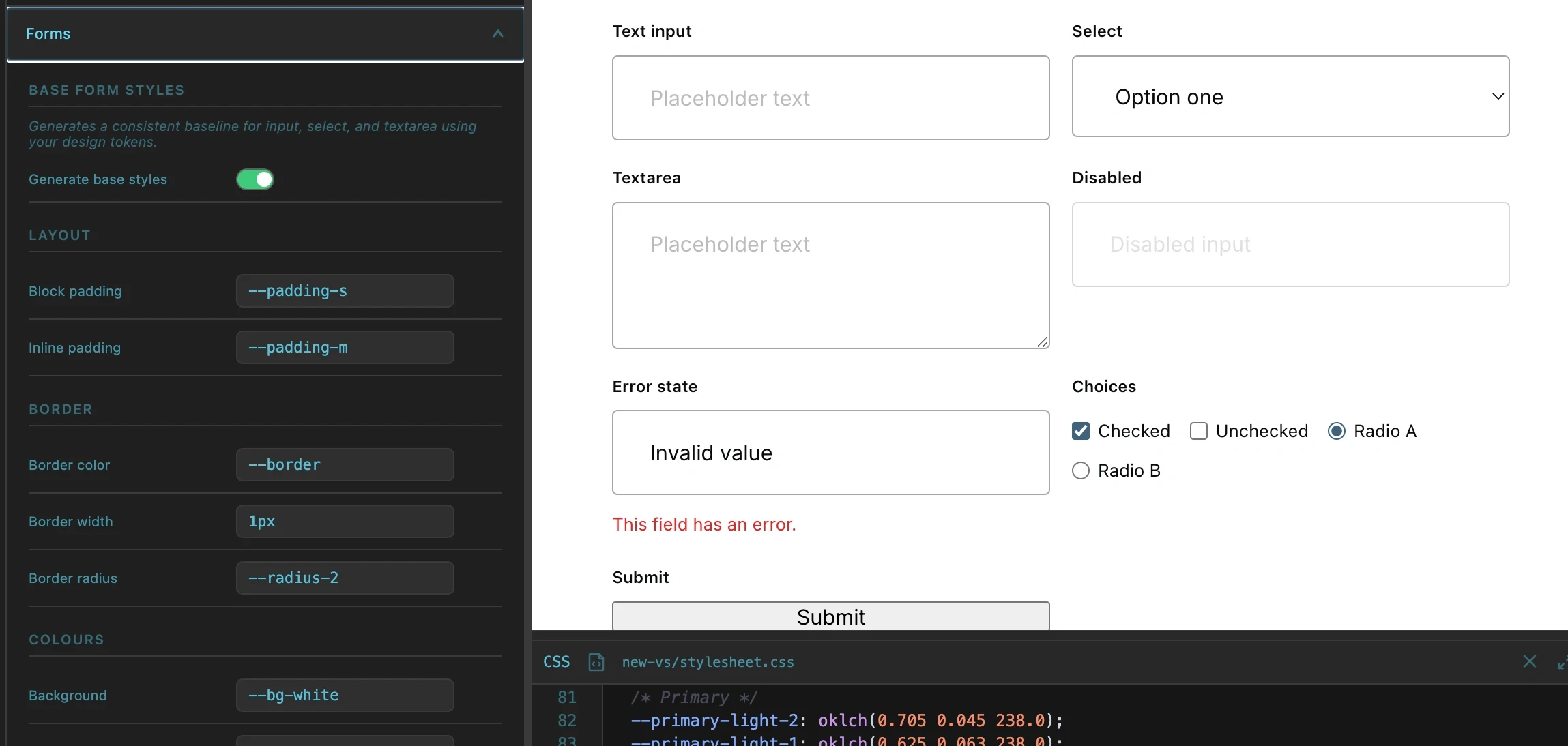
Component Sections
Buttons, forms, cards, links — all in one file.
GenCSS generates pre-built component foundations. Buttons with variant support, form inputs with validation states, card containers with dark variants, link styles — all using the token system.
- Button system: filled, outline, and custom variants
- Form inputs with validation states and focus styles
- Card containers with light and dark variants
- Link variants with hover and visited states
No Lock-in
Plain CSS. Yours to keep.
GenCSS outputs a single, readable CSS file. No runtime, no proprietary format, no build pipeline dependency. Drop it into any project. When you stop using GenCSS, the file keeps working.
- Output is standard CSS — no proprietary syntax
- No JavaScript runtime dependency
- Works in any stack, any editor, any host
- You own the output completely